Palladio is a data-driven tool for analyzing network relationships across time. It was created by Stanford University’s Humanities and Design Department. Their goal was to understand how to design graphical interfaces by developing a general-purpose suite of visualization and analytical tools. The basis of their project was the visualization tool prototypes created for the Mapping the Republic of Letters project, which examined the scholarly communities and networks of knowledge during the period 1500-1800.
My class assignment was to learn how to use Palladio by leveraging the Alabama state data from the WPA’s Slave Narrative project. In this particular case the lesson plan guided us how to up load the data and create related tables.
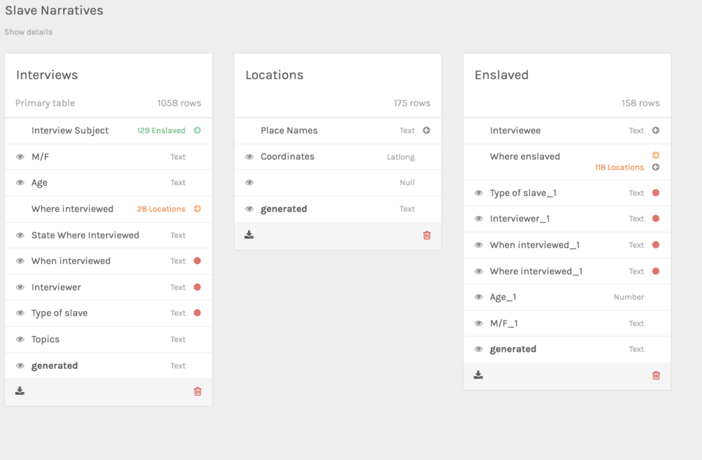
The online application was very simple to use and the upload process was quick. With the data uploaded, the exercise was rather straight forward learning how to determine relationships between source and target data.
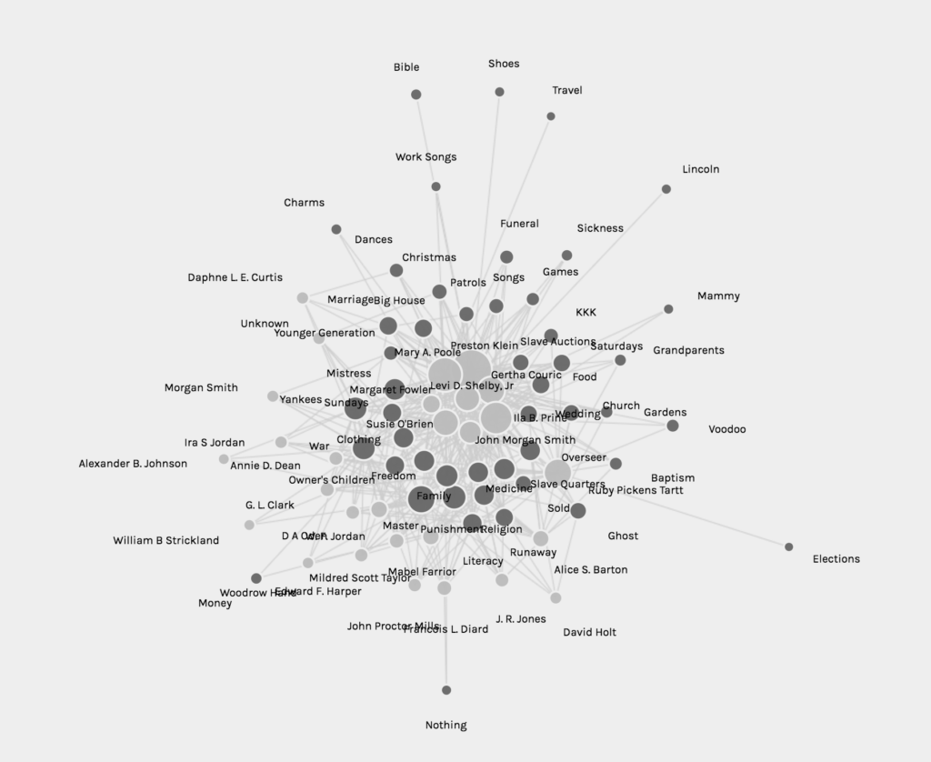
Based on the original source data, I was able try various combinations. For example I selected source data from the interviewers and target data of the topics discussed. The application automatically generated a graph (shown at the top). From this graph I could start defining network relationships by interpreting the visualizations.
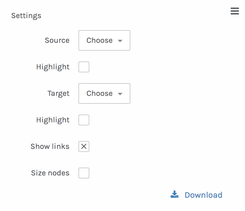
The interface is quite intuitive and permits easy experimentation if you are not satisfied with the initial results. There are a few available adjustments that you can make with the tool to improve the display of the data. An important feature of the graph options is that a user can drag a point or highlight one or another data source to create a dynamic view of the visualization.
If you want to try it for yourself go the following link: