Categories
Digital Humanities Internship

Internship Post#2

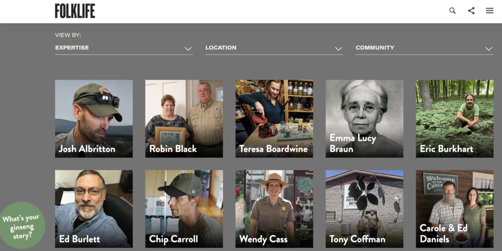
The best part of being an intern is observing and learning. Since you don’t have any responsibility you can stand back and gain a new perspective. It is expected that interns will only be given peripheral assignments, but this gives them the luxury of time to absorb and learn from what others have done. For my internship with the Smithsonian’s Center for Folklife & Cultural Heritage, my job is to assist with the launch of their new website “American Ginseng: Local Knowledge, Global Roots.” Since the project was already well underway there was not much I could offer in the way of web development. However, by arriving at such a late stage in the project my user experience with the site offered some welcomed and neutral perspectives.

Often those close to a project lose their objectivity. They expect everyone to share their passion about the topic and have familiarity with the information presented. In the case of American Ginseng, the site tries to connect local folk knowledge with an overall global perspective. The site does a good job of collecting individual stories, the “Global Roots” is lacking. This could be a problem, especially for visitors that are encouraged to explore the site, but lack a broader understanding of the subject. As a result I recommended that an introductory video, 2-3 minutes would enhance the site’s potential to reach a wider audience. The inclusion of a video would provide the necessary background information to encourage visitors to click on the various stories. Also, overall web analytics confirm that users tend to stay longer on a site when offered the opportunity to watch a video.

The good news is that the idea, so far, has been received well and the production of such a video falls well into my area of expertise. The Smithsonian already has an extensive library of video and still imagery to draw upon to ensure their is sufficient media content for its production. The web team may be hesitant to embrace the idea since the current navigation does not provide a link to multimedia. This is where a shared goal may need to be communicated.

From a learning perspective, trying to engage the project team and get them to accept the necessity of adding the video reminds me of an earlier point in my career. As an assistant producer it was important to present the “facts” to senior staff and gain their acceptance of an idea. Sometimes even let them think that it was their idea. For me adding the video is a no brainer, especially if it will enhance the overall success of the project.

Since it is easy for me to produce such a video, I will need to be sensitive to others who think it might be too complex. They might tend to lean towards saying no due to the bureaucracy. In presenting the case for why it is important I need to stress that an introductory video is an opportunity to leverage the tradition of “oral history” which the Folklife Festival is so well known for. The American Ginseng site was originally designed just for text stories. I understand why, since the submission of “video” would create a nightmare of media quality issues. However, multimedia, especially video, is a clear preference for time conscious visitors. This is evident in web stats and the popularity of YouTube and Instagram.

Finally, as an intern I am having to re-learn how to not only point out a problem but also offer the solution. While I have the luxury to second guess the project’s original goals and objectives, I also have the responsibility to ensure that it succeeds as well. Stay tuned, it will be interesting to see how the outcome.

Categories
Digital Humanities Internship

Smithsonian Internship Post #1

Smithsonian Castle

Last week I officially started my internship with the Smithsonian’s Folklife and Cultural Heritage Department. Having lived in Washington DC for over 40 years, working for the Smithsonian has always been high on my bucket list. Also, 40 years ago I started my first internship with the United States Information Agency as a still-photographer. One of my first assignments was taking pictures of the Folklife Festival on the Mall. Its funny how life can come full circle.

According to the Smithsonian’s strategic plan, its goal is to ” build on its unique strengths to engage and to inspire more people, where they are, with greater impact, while catalyzing critical conversation on issues affecting our nation and the world.” In regard to Folklife and Cultural Heritage, its mission is to “through the power of culture, we build understanding, strengthen communities, and reinforce our shared humanity.”

As part of this strategy one of the primary goals and objectives is to “Promote awareness of our collections through conferences, presentations, and digital outreach.” To support this digital outreach effort the Folklife and Cultural Heritage group is turning towards social media and that is where my internship comes into play. I have been assigned to a particular project called American Ginseng: Local Knowledge, Global Roots.

American Ginseng is a new website developed by the Smithsonian Center for Folklife & Cultural Heritage. This site presents the shared stories of a wide variety of people with intimate knowledge of the harvest, cultivation, trade, medicinal use, and conservation of this fascinating plant.

Relatively unknown, American Ginseng is highly prized in Asian traditional medicine. Grown in the wild in the eastern United States, the plant’s root can be worth well over $500 a pound. The story of American Ginseng goes back several hundred years and for many communities in Appalachia, the prized root has been a source of much needed income.

Unfortunately due to its high value and the degradation of its natural habitat, wild American ginseng faces many threats, from encroaching suburban sprawl and extraction industries to the environmental impact of climate change. The goal of the American Ginseng project is to promote conservation efforts. By using social media to encourage growers, dealers, and researchers to share their stories, it is hoped that the site can be a digital advocate for — “protection by government agencies, education on good stewardship, cultivation in forest settings, and research into accelerating its propagation” — and most importantly help ensure the survival of American ginseng for future generations.

My initial role is to assist with the development of a social media strategy. A brief online survey has determined that there are hundreds of websites and Facebook groups dedicated to the subject of American Ginseng. The new American Ginseng site will be launched later this Fall. Its success will be dependent upon a strategy that includes the creation of a social media toolkit to help promote the site. The toolkit will include the graphic presented above, #GinsengFolklife hashtag, and suggested language for Facebook groups to post links to the new site.

I am most interested in observing how effective a social media strategy will be in generating interest in the website. The topic of American Ginseng is a fascinating story, but it is definitely not mainstream. However, the global brand of the Smithsonian is very powerful and it will be interesting to track how quickly the word spreads about the website and if the content overlaps into mainstream media.

Categories
Digital History Research Digital Humanities Mapping the Civil War

A post on my final project

Mapping the Civil War in Arlington” is the final project for my Introduction to Digital Humanities course at George Mason University. “Mapping” tells an interesting story of how young volunteers from all over the north answered the call to save the Union and free the slaves in 1861. They traveled hundreds of miles (some over a thousand) from northern states and cities to camps located in Arlington, Virginia to defend the Capital. The project is a prototype of how to use historical maps to identify GPS coordinates on a modern map.

The primary resource used for the project is Kepler.gl. A powerful open source geospatial analysis tool for large-scale data sets. The primary data source were the longitude and latitude points identified by researching historic maps from the Civil War. I was able to leverage another resource provided by the David Rumsey Map Collection, called the “Georeferencer”.

The key to the project was the discovery of two 160 year old maps created early in the war. One map is called the “Sketch of the Seat of War” and the other is the “Map of the Ground Occupation and Defense of the Division of the U.S. Army in Virginia 1861”. Both maps captured the locations of over 50 regimental camps in Arlington during 1861. Once the regiments were identified it was then easy to research their individual histories and discover what city or state they came from.

As the project proceeded I realized that the data was bringing to life an interesting and relatively unknown relationship between Arlington and the cities and states of the north during the early part of the war. The timeline feature of Kepler provided an opportunity to display in a dynamic way when and where the regiments were mustered in and when and where they eventually camped in Arlington. As a prototype, I was aware that the projected needed to be scoped so that it demonstrated a capability, but did not get too bogged down in details. Kepler proved to be a valuable resource, but I would eventually like to do more with the individual endpoints and provide more interactivity, such as links to the regimental histories, the cities they came from, and individual soldier stories.

The primary goal of the project was to provide local historians and elementary school teachers/students a resource to discover and learn more about Arlington’s role in the Civil War. During the peer review process I was provided some very useful feedback to improve the project by linking the project site to the Arlington Historical Society. Their recommendation provided an opportunity to actually employ the social media communication plan we learned about doing in class. In addition, I created a list of academic competency questions that teachers and students could use to better understand how to use the maps and data provided.

Finally, the project provides a new perspective about using old resources. By employing Kepler.gl, “Mapping” provides a way to make something as static as a map, very dynamic. The final project exceeded my expectations because it visualizes a very compelling story about how Arlington in 1861 was at the epicenter of the Civil War. Overnight, tens of thousands of Union troops arrived from cities all over the north. These inexperienced, volunteer troops, were still untested and the horrors of the war were still waiting ahead. For most of these soldiers it was the first time they took a train or traveled beyond 20 miles from where they were born. Upon their arrival in Northern Virginia it was the first time they entered the south and saw slaves. By linking the camp locations with the regimental origin points a previously unknown part of Civil War history is emerging. A history that Arlington can now claim as its own.

Categories
Digital Humanities social media strategy

Developing a Social Media Strategy for the “Mapping the Civil War in Arlington” Project

During the first few months of the Civil War, Brigadier General Irvin McDowell ordered a topographical survey of Union forces and defenses in Northern Virginia. The survey led to the creation of a detailed map that shows the locations of forts and regimental camps. Almost 160 years old, the “Map of the Ground Occupation and Defense of the Division of the U.S. Army in Virginia” is a visual reminder of the tens of thousands of Union troops that once occupied Arlington County.

The McDowell survey is part of a broader digital humanities project to use historic maps to plot the location of these forgotten sites on a contemporary and online map. While the location of the forts are well known, the challenge is trying to identify the precise GIS coordinates of the camps. The goal of “Mapping the Civil War in Arlington” is to provide an educational resource for three primary audiences. These include: 1) fourth grade teachers and students in Arlington County, 2) Civil War historians, and 3) local neighborhood associations.

In the state of Virginia, the topic of the Civil War is introduced to elementary students in the 4th grade. “Mapping the Civil War” brings history closer to home for these students. Plotting the locations of Union camps on a modern map using applications like Keppler.gl, will help students to literally discover the history in their backyards. Teachers will be able to use the GIS data to create visual timelines and track how the Union Army grew in size.

For Civil War historians, “Mapping the Civil War” makes accessible a new collection of data that focuses on a relatively unknown historical period. From May to October 1861, Arlington was the front line between Union and Confederate forces. A comprehensive overview of the location of the regimental camps, forts, and military engagements provides a different narrative. These northern regiments, were untested, poorly trained, and experiencing the south for the first time. Many of the Union Army’s future military heroes , like William Tecumseh Sherman, were still not battle tested.

Finally, neighborhood associations in Arlington are very active in historic preservation. “Mapping the Civil War” provides these associations with a new historic perspective. Residents will be able to look online and see who camped in their backyards.

In order to reach teachers, students, historians, and local residents, “Mapping the Civil War” requires a well defined social media strategy. Since the project has a wide audience, it will require the use of several different social media platforms and tools. At the core of the strategy will be the use of a website that will host the online mapping tool. The site will also provide teacher guides and proposed learning activities for students.

The strategy will also include a blog that will provide a location for historians to review update research and engage one an other. The project blog should be updated frequently. In addition, the project should utilize YouTube and Instagram to encourage project contribution by generating “then and now” videos. The goal would be to get students to go visit sites near their elementary school and integrate historic photos with contemporary video.

In regard to the project’s overall message, Civil War history is going through a 21st century revision. As a southern state, Virginia traditionally looked back at the Civil War through a “Lost Cause” filter. But “Mapping the Civil War” provides a new narrative that highlights Arlington’s role in saving the Union, freeing the slaves, and the creation of the Army of the Potomac.

During the first year of the Civil War Arlington was host to tens of thousands of young, inexperienced soldiers from all over the north. These men spent months in Arlington learning how to fight and eventually win the war. Many of the soldiers wrote letters to family back home and kept diaries about their experiences in Arlington and life in the army.

The project networks the digital collections of these first hand accounts with where the soldiers camped. This provides students in Arlington an opportunity to personalize and connect with their local history.

Soldiers of the 23rd New York

Another goal is to engage with a large group of Civil War historians and researchers. This period of Civil War history has often been overlooked. The project is not only about mapping the physical location of the Union regiments, but tracking their activities later in the war. Enabling and leveraging crowdsourcing will shed light on new historical perspectives.

Finally, utilizing Facebook, the project can engage and assist local neighborhood associations with future preservation projects. For example, as part of the “Lost Cause” legacy, many Arlington street names still favor Confederate generals. It would be interesting if the project could encourage and support the renaming of some of these streets with Union officers like General Sherman.

As part of the social media strategy the project will identify some “SMART” goals. These will include specific, measurable, realistic, and time-bound goals. For example, the success of the Facebook strategy will be determined by how many of the neighborhood association sites promote the project. The website and blog statistics will also provide a benchmark for tracking audience growth and an opportunity to respond to comments and questions. The posting of YouTube and Instagram videos and photographs will provide a significant measurement of how well the project is engaging with the local schools. A final measurement of success will be to track and identify other social as well as traditional media responses to the story.

Categories
crowdsource Digital Humanities digitization

Using Crowdsourcing for Digitization

Mark Twain’s Tom Sawyer getting help to whitewash Aunt Polly’s picket fence.

In his book, “The Adventures of Tom Sawyer,” Mark Twain (Samuel Clemens) provides a useful metaphor for crowdsourcing and digitization. Tom turns a boring chore (whitewashing) into something desirable for others to do. What makes the story timeless is that over 144 years later people are still trying to get others to do the work for them. In the realm of digital humanities, transcribing hand written documents or identifying or vectoring shapes, is a tedious and time consuming task. A project with tens of thousands of documents used to take decades to scan, transcribe, and digitize. However, organizations are turning towards crowdsourcing as a way to reduce costs, and speed up the process while creating a community of interest in the project.

People have been participating in crowdsourcing efforts for years without even knowing it. For example, sites that use photo identification or text entry for non-robot identification, leverage the crowd to accomplish some simple digitization tasks. But it is the bigger trend of organizations purposefully creating interfaces to permit the public to contribute to the digitization process that is worthy of review.

Our crowdsourcing assignment was to review the pros and cons of leveraging public participation in digital collections. It would appear that a growing number of institutions are outsourcing some digitization functions to a public community instead of depending solely on employees. This makes sense considering the sheer drudgery and cost of trying to digitizing large collections. For example, “Papers of the War Department 1784-1800” is a perfect example of how to leverage crowdsourcing to perform correction and transcription contextualization. Currently hosted at the Center for History & New Media at George Mason University, the project’s goal is to restore and make accessible this historic collections of over 42,000 U.S. military records once thought lost in a tragic fire.

Public users accessing the “Papers” site are invited to search, review, and transcribe the remaining hand written documents that need to be digitized. The interface is quite simple and permits users to read a scanned image of the document while attempting to transcribe. In very little time I was able to get familiar with the interface and start transcribing. My only problem had to do with retraining my self to read cursive hand writing from over two hundred years ago.

New York Public Library’s Building Inspector site.

Another example of using crowdsourcing is the New York Public Library’s “Building Inspector” site. This project is a little more whimsical and fun. I think Tom Sawyer would not have had such a hard time getting his friends to participate. In an attempt to gain insight from old New York City inspection maps, the Building Inspector site invites users to assist in vectorization or shape discovery of old buildings outlines. In a rather simple, but addictive process, users have only to visualize an outline of a building and determine if it is correct or not, and whether it needs to be fixed. The reason that humans are better than a machine in reviewing the outlines is our ability to quickly determine if it looks right. A rather mindless activity that even elementary students could participate in. It is a good example of how humans can still do the work of a machine if only enough are willing to provide the time necessary to complete the task.

Of the two examples, Building Inspector is probably a better prototype for the future of crowdsourcing digitization projects. Reviewing building outlines is much more suitable for engaging a bigger crowd. Papers of the War Department requires a more scholarly effort. Transcribing is much more intensive work and I would even say a specialty. The site tries to mitigate that problem by offering various degrees of difficulty for the contributor.

It is clear from this assignment that “contributory” projects are here to stay and will only increase in numbers. As online technologies and interfaces improve more of the public will be able to “interact” or access digital and/or physical artifacts provided by institutions (e.g., providing notes on museums’ objects; tagging on galleries’ digital collection). If the interface and tasks or made to be engaging and interesting, the contributors will come back often and the value of the crowdsource will be self evident. However, if the tasks that the participants are asked to perform are too difficult then the number of contributors will be limited. As with Tom Sawyer, it is not enough to just get someone else to do the work. Eventually, they will want to see what is in it for them.

Categories
Digital Humanities Mapping

Comparing Networks and Visualization Tools

There is a growing number of online research tools that are having a significant impact on the field of digital humanities. Easy to use, and accessible, these tools or applications are quite powerful in their ability to permit researchers to sift through large data sets and visualize network relationships. For the past several assignments I was able to test and review three popular tools. These include Voyant, Kepler.gl, and Palladio. While each tool was unique in terms of its interface and original purpose, provided a means to an end. This is an important distinction, especially if one was starting a research project and needed to get a handle on whatever data was available.

For example, Voyant is a “text mining” application that permits the end user to enter large volumes of corpus and visualize text clouds, or tag clouds. This provides a significant capability if one is not clear as to what the text describes or includes. Kepler provides a very specific feature set that allows end users to enter geospatial data and generate a variety of maps. On the other hand, Palladio is much more robust providing several important features such as mapping, graphing, customized lists, as well as a gallery view for images.

While each application on its own provides value, the real lesson for any DH researcher is to be prepared to utilize a variety of tools to visualize and map data. This requires a level of effort to experiment and test each application’s capabilities. Voyant provides the end user a rather straight forward approach to discovering word patterns or hidden terms. Kepler provides a relatively easy way to present physical location data over time. Finally, Palladio permits the end user to visual patterns of relationships. This becomes an important factor when trying define interdependencies in a humanistic study.

As part of my class assignments using the WPA’s Slave Narratives data, the integration of all three tools would be beneficial in analyzing the 1930s research. Voyant could be used to define text patterns of the questions asked and the subjects responses. Kepler could be used to demonstrate that their was a relationship between the physical location of where the interviews were conducted, versus the location of where the enslaved person was from. Finally, Palladio using mapping, graphing, lists, and image gallery, could provide an acceptable interface to explore the final results.

Categories
Digital Humanities

Network Analysis with Palladio

An example of a graph generated by Palladio.

Palladio is a data-driven tool for analyzing network relationships across time. It was created by Stanford University’s Humanities and Design Department. Their goal was to understand how to design graphical interfaces by developing a general-purpose suite of visualization and analytical tools. The basis of their project was the visualization tool prototypes created for the Mapping the Republic of Letters project, which examined the scholarly communities and networks of knowledge during the period 1500-1800.

My class assignment was to learn how to use Palladio by leveraging the Alabama state data from the WPA’s Slave Narrative project. In this particular case the lesson plan guided us how to up load the data and create related tables.

The online application was very simple to use and the upload process was quick. With the data uploaded, the exercise was rather straight forward learning how to determine relationships between source and target data.

Based on the original source data, I was able try various combinations. For example I selected source data from the interviewers and target data of the topics discussed. The application automatically generated a graph (shown at the top). From this graph I could start defining network relationships by interpreting the visualizations.

The interface is quite intuitive and permits easy experimentation if you are not satisfied with the initial results. There are a few available adjustments that you can make with the tool to improve the display of the data. An important feature of the graph options is that a user can drag a point or highlight one or another data source to create a dynamic view of the visualization.

If you want to try it for yourself go the following link:

http://hdlab.stanford.edu/palladio/

Categories
Digital Humanities Mapping

Mapping History

Kepler.gl is a powerful open source geospatial analysis tool for large-scale data sets. In plain english it lets you visualize data by mapping multiple location points and letting the user use both time and distance as a means to tell a story. The system is designed for both technical and non-technical users. The key is to learn how to use the available filters to visualize the insights that you what users to explore.

The Kepler.gl workflow is based on data layers that permit the creator to present a variety of visualizations including “points”, “lines”, “arcs” and even a “heatmap”. Kepler provides a variety of map styles, color palettes, and map settings. Like most well thought out applications, users need to only spend a little time getting familiar with the interface. It is highly recommended to start with a small project to get better acquainted with Kepler’s unique and very useful features.

For my class assignment we used mapping data collected during the 1930s Works Progress Administration (WPA) Slave Narrative Collection. From 1936 to 1938 the Federal Writers’ Project undertook a major initiative to compile the histories of former slaves living in seventeen states. I was able to use data gathered in the state of Alabama. The map data displayed below shows the relationship of where the subject was interviewed and where they were originally enslaved.

Recent technologies like Kepler Gl. will provide researchers a whole new way of using maps to visualize large collections. The fact that I was able to bring alive dormant data that had been stored somewhere for over 70 years is impressive. But the key to a successful project will be obtaining consistent and accurate mapping data.

Categories
Digital Humanities Sources for Finding Digital Data

Mining for Text

For thousands of years humans have understand the power of the written word. As a result great care was given to preserving books and other written documents. But in the digital age we live in there is a desperate need to be able to sift through the ever growing volumes of generated text. Fortunately for us new information technologies are available to us average folk that enable us to mine digital text.

Recently I was able to test drive an application called “Voyant”. On their website they describe themselves as a web-based reading and analysis environment for digital text. For us digital historians Voyant is an inexpensive was to explore the world of text mining. As with all things digital, not everything is as simple as it looks. Voyant is no different. In text mining projects involving large corpus there is both a pro and con to how to proceed. What makes Voyant incredibly powerful is its intuitive user interface and visual displays. Unfortunately the user needs to understand the basics of text mining. For example, there needs to be some familiarity with concepts such as vocabulary density, frequency, and distinctiveness. Also, mining operation has to distinguish between the overall findings for the corpus or collection, versus the unique findings that can be found in an individual document.

For my class we were assigned to use a rather interesting text collection called the “WPA Slave Narratives“. It was a Works Progress Administration project from the Great Depression, where writers set out to gather and capture the stories of formerly enslaved people. As a historical collection it is a fascinating look back in time. The writers collected testimony from 2.300 people across 17 states. it includes over 9,500 pages. In the past trying to conduct a text mining project of this size would have been insurmountable. But the moment the original collection was scanned and digitized the narratives became a valuable resource. A quick search online revealed that dozens of books have been written using the collection.

The slave narratives was an excellent case study to try to work through how one can leverage text mining. The nature of the original project back in the 1930s never intended to be “mined” digitally. But what I learned is that in the writer’s attempt to record the narratives as authentically as possible, they also captured the interviewees variances of local dialect, poor grammar, and faded memories. As a result. the entire corpus reflects a unique challenge to sort through digitally today.

The value of using an application such as Voyant can not be minimized. It really helped identify the variations in word usage through the text cloud, but it was the other available functionalities, ie: reading, trends, context, and summary tools that provided a way to identify thematically similar information across the corpus. I highly recommend getting started using Voyant, but be prepared to navigate through a new way of thinking about how words are related, and how they need to be extracted to gain better insight or value.

Categories
Digital Humanities Metadata

Why Metadata Matters

“If you are not having fun you are doing something wrong.” Groucho Marx

For a previous class assignment I reviewed the “Market Research & American Business, 1935 -1965” digital collection.  The site provides a wealth of information regarding America’s consumer culture. One notable feature of the collection is how well it incorporates metadata in its search features. Unlike a search engine site which encompasses a broad and wide range of objects, digital collections by their very nature, are more narrow in scope. They can be more surgical in their use of key words and metadata.

We know that metadata is descriptive information that assists users in looking for digital objects like images, documents, and media files. But not all online collections use metadata consistently. When properly applied metadata ensures a higher degree of success in making digital objects discoverable. This is due to the fact metadata helps users create associations or relationships between objects. As a result they can use the choices of metadata to ask relevant questions and get the search results they need. However, more often than not, valuable information stored in collections go undiscovered. This is due to the poor use of metadata and user frustration with search results.

Market Research & American Business is a good example of how to properly describe a collection’s available content through its navigation options and metadata. Users are provided several ways to search for objects. This includes well defined directories and a useful “glossary” page that presents a extensive list of key words that can be applied to advanced searches.

The collection focuses on both marketing research and studies (documents) as well as the images of the advertisements from the 1935 – 1965 period. The metadata associated with the collection’s objects provides the user a good overview of the era’s brands and companies as well as the industries they serviced. What makes the collection unique is the discoverable research that provides a behind the scenes vantage point of the psychology behind the major American marketing campaigns of the era. 

1940’s advertisement for Air France

However, the site’s features and metadata does not easily provide identifiable information on the types of studies conducted or the intended audiences response to the specific advertisements and campaigns. This would be a valuable resource that would permit future researchers to study the effectiveness of marketing during this period.

For researchers using the collection, the site’s application of metadata and search functions permits some interesting questions to be asked. For example, the availability of consumer research by industry permits questions to be raised on what impact did variables such as sex, or race, of the intended audience have on how they responded to certain brands or product purchased. Also, the three decades of available digital objects, allows a user to track significant trends in the changing marketing styles of the era (tail fins on 1950s automobiles).

Unfortunately the site is limited in scope to only three decades of research and the collection of one marketing expert, Ernest Dichter. While the collection is a significant glimpse into how Americans were persuaded to purchase and consume, it does not provide a complete catalog of available objects during the period. As a result the site’s metadata does not allow you to ask some very obvious questions. For example were American consumers really oblivious to being manipulated during those decades? As consumers, are we any different today?

css.php